Web Design Sheffield
How Responsive Design Shapes SEO Success and Search Rankings
Website accessibility is no longer a bonus — it’s a necessity. As customers increasingly browse, shop, compare options, and make decisions across multiple devices, businesses must ensure that every page displays smoothly without friction. We understand that strong digital performance begins with an adaptable, flexible platform. In this blog, we’ll explore how responsive design strengthens SEO, improves ranking signals, and creates a faster path to conversions for growing brands.
Below we break down the five essential areas where design and SEO work together.
Search Engines Prioritise User Experience
Google has openly shifted from ranking websites purely on keywords to measuring real user satisfaction. This includes how quickly pages load, how easily users navigate, and whether information is accessible without zooming or scrolling sideways. Websites that display well across all screen sizes naturally earn better engagement metrics — lower bounce rates, more page views, and higher interaction levels.
These behavioural signals play a powerful role in organic ranking. When a visitor enters, scrolls, clicks to another page, and continues browsing confidently, search engines interpret the website as helpful and relevant. Over time, this leads to stronger placement in search results, especially in competitive spaces like homeware retail and health-based e-commerce. A smooth experience across screens ensures that users stay longer and convert more frequently.
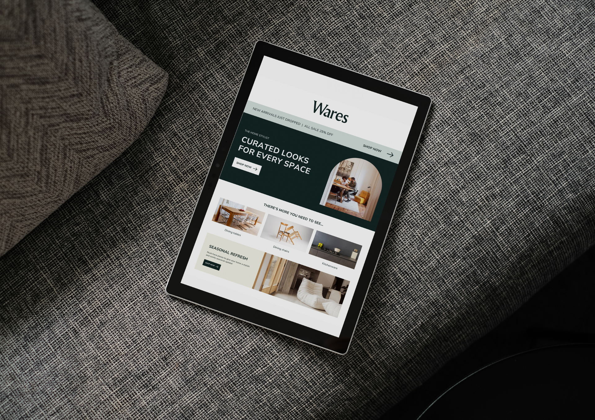
For retail businesses particularly, clear product display, effortless menu navigation, and quick access to checkout options can make or break a sale. A mobile-friendly design isn’t simply aesthetic — it directly influences revenue.
One Responsive Website is Better for SEO Structure
Some older websites still maintain separate desktop and mobile interfaces. While functional, this approach splits content, redirects traffic between versions, and introduces duplicate pages into search indexes. Consolidation solves this. A single layout that adapts intelligently ensures that every link, blog article, product listing, and page of text contributes to one clear source of authority.
Instead of dividing domain strength across two variations, unified design builds gradual, consistent SEO equity. Page-level improvements benefit the entire website, and maintaining content becomes far more efficient. A single search-friendly structure also reduces crawl errors, indexing delays, and conflicting metadata — three issues that often block ranking growth.
With streamlined information architecture, businesses can plan and scale easier. Updates roll out faster, seasonal collections launch cleaner, and content marketing strategies remain organised. Brands in wellness, retail, and home décor industries especially benefit from this long-term clarity.
Mobile-First Indexing Makes Adaptability Non-Negotiable
Google now evaluates most websites using mobile-first indexing. This means your smartphone version influences rankings more than desktop. If text is unreadable, buttons are too small, or elements overlap, the algorithm treats these as accessibility issues.
A seamless responsive web design ensures that typography adjusts to screen width, images scale automatically, and navigation remains comfortable to tap. For example, if a homeware brand showcases a new sofa collection, customers should be able to zoom through details, slide product images, and compare pricing comfortably. Strain-free interactions reduce abandonment rates significantly.
Businesses that overlook this shift risk losing organic visibility regardless of how strong their branding or content may be. A flexible layout protects authority, nurtures growth, and ensures digital reputation remains competitive long term.
Page Speed and Technical Performance Affect Rankings
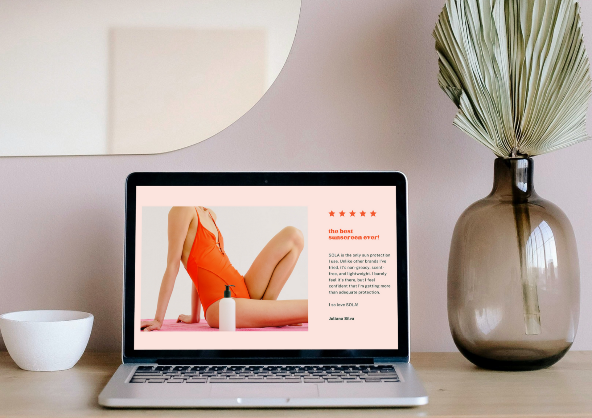
A slow or unstable website frustrates users — and Google knows it. Optimised caching, compressed media files, and adaptive scaling are vital for speed. This is especially true for large-image sectors like retail and home furnishings, where visuals are essential for decision-making.
A fully responsive design reduces load strain by serving the right asset sizes to each device. Rather than forcing a desktop-resolution image onto mobile, scaled delivery keeps performance light and efficient. Faster page load times directly influence Core Web Vitals, a measurable ranking factor that contributes to greater search visibility.
Visitors expect information instantly. Brands that meet this expectation will convert more users, earn repeat visits, and position themselves as trustworthy digital providers.
Design Adaptability Supports Brand Identity Across Screens
A customer might first discover your business on social media, visit your homepage via phone, then explore products later on a laptop. The brand should feel consistent at every stage — not fragmented. Cohesive layouts improve perception, familiarity, and emotional trust.
A well-planned responsive website design ensures colours remain crisp, buttons feel familiar, and product stories hold the same clarity everywhere. For health and wellness companies, this could mean smooth navigation through service guides, class schedules, or product ingredient breakdowns. For retail, it could mean stable browsing during peak sales traffic.
Digital experience is an extension of your business identity. Visitors judge reliability based on performance, ease of use, and professional presentation. Consistency builds loyalty — and loyalty supports ranking longevity.
A professionally structured responsive design creates a consistent user experience across devices, ensuring clarity and ease of navigation.
When planning ahead,
mobile website design supports growing audiences who research and shop primarily through smartphones.
Brands exploring visual commerce benefit from
mobile web design, enabling customers to browse and purchase effortlessly wherever they are.
Responsive experience determines how customers interact with your business. Google measures satisfaction, navigation, loading stability, and behavioural engagement every time a page is opened. When your platform adapts fluidly, customers continue browsing, explore deeper, and trust your brand more. Over time, these signals solidify authority, strengthen search placement, and widen reach across competitive digital markets.
Businesses that invest in flexible design build stronger foundations for long-term visibility. Mobile-first indexing proves one message clearly: adaptability defines success. The better your content responds to the device in hand, the more valuable your business becomes to both customers and search engines.
Web Design Sheffield develops websites that feel confident, fast, and future-ready. Our approach blends aesthetics with measurable performance so every page loads smoothly and encourages engagement. We build digital environments designed to strengthen rankings, reduce bounce rates, and support scalable growth for homeware, retail, and wellness-focused brands.
From UX planning to SEO-aligned structure, our solutions prioritise clarity, fluid navigation, and long-term maintainability. Every project is prepared to evolve alongside your business — ensuring stability today and resilience for tomorrow.
Update on X: Improve search rankings with
responsive design – here’s how!