Web Design Sheffield
How To Optimise And Improve Website Design
In the digital age, website design is not just about aesthetics; it's a crucial element that impacts user experience and the success of your business online. As we navigate through the complexities of digital marketing, it's essential to understand that a well-designed website is the cornerstone of your online presence. For businesses in Sheffield and beyond, optimising website design is not merely a task; it's an ongoing journey towards creating impactful user experiences and enhancing brand visibility.
Understanding the Basics of Website Design
Website design includes many elements, including layout, colour scheme, typography, content, and functionality. At its core, it's about creating a platform that is not only visually appealing but also user-friendly, accessible, and optimised for search engines. Effective website design aims to match aesthetics with functionality, ensuring users can find the information they need quickly and efficiently.
Website design is pivotal in search engine optimisation (SEO) and online branding. A well-designed website can significantly improve your site's visibility on search engines, increasing traffic and potential business opportunities. In Sheffield, where the market is competitive, having a website that stands out through excellent design and SEO can be the deciding factor in your business's success.
Design for User Experience (UX)
User Experience (UX) is at the heart of modern website design. A user-centric approach ensures the website is designed with the target audience in mind, providing a seamless and intuitive experience. Here are some key considerations for optimising UX:
- Navigation: It should be straightforward and logical, allowing users to find what they need without unnecessary clicks.
- Content: Quality content is essential. It should be relevant, informative, and easy to read and complement the overall design.
- Accessibility: Ensure your website is accessible to all users, including those with disabilities. This includes using proper contrast, text size, and alternative text for images.
Optimising for Mobile-First Indexing
With the increasing prevalence of smartphones and tablets, mobile-first indexing has become a standard practice in web design. A mobile-first approach means designing your website with the mobile user in mind before creating a version for desktop users. This approach is crucial because:
- Mobile usage is rising, and more people are accessing the internet via mobile devices than desktop computers.
- Google prioritises mobile-friendly websites in its search results, which can significantly affect your SEO performance.
Speed Optimisation
Website speed is a critical factor in user satisfaction and SEO performance. A fast-loading website provides a better user experience and ranks higher in search engine results. To optimise your website's speed, consider the following:
- Optimise Images: Large images can slow down your website. Use image compression tools to reduce file sizes without compromising quality.
- Leverage Browser Caching: Browser caching stores website resources on local computers, reducing loading times for repeat visitors.
- Minify CSS, JavaScript, and HTML:
Removing unnecessary characters from code can speed up your website's processing time.

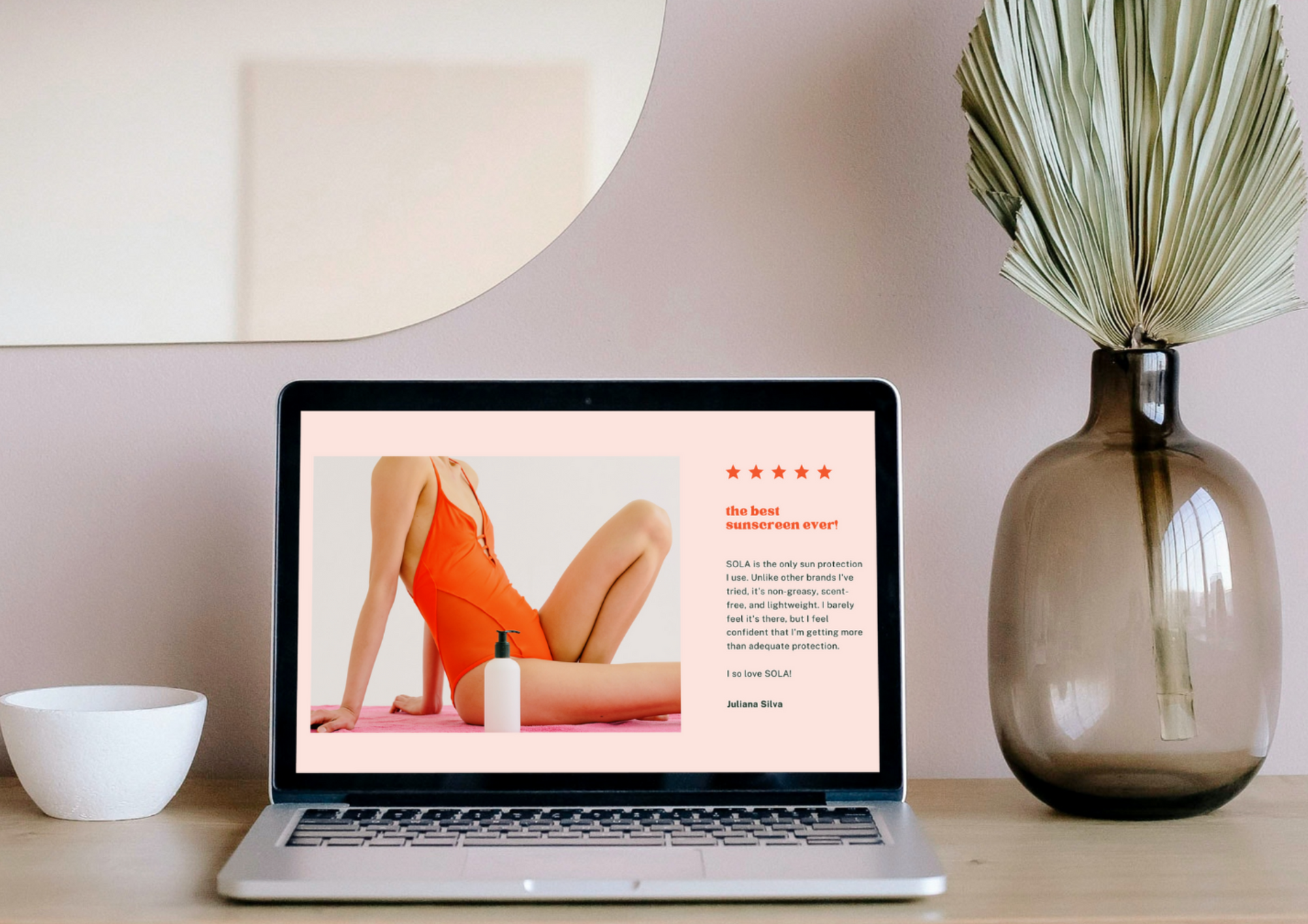
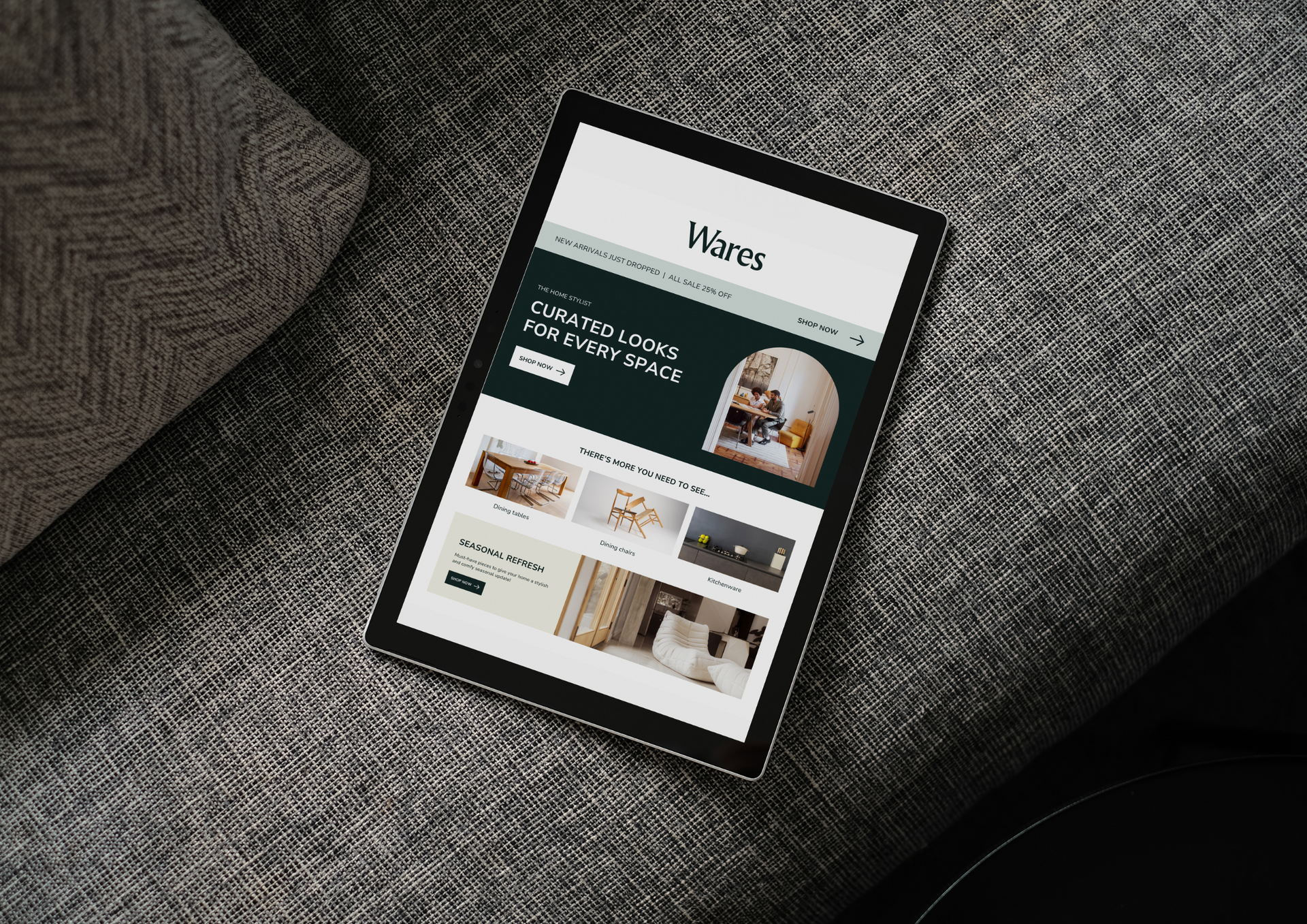
Visual Elements and Branding
The visual aspect of your website first captures visitors' attention. Creating a design that reflects your brand identity and resonates with your target audience is essential. Here are some tips for integrating visual elements and branding into your web site design:
- Consistent Colour Scheme: Choose a colour palette that reflects your brand and is pleasing to the eye. Consistency across all pages strengthens your brand identity.
- Typography: Select fonts that are easy to read and match your brand's personality. Consistency in typography also aids in brand recognition.
- Imagery: Use high-quality images that align with your content and brand message. Custom graphics and photographs can enhance the visual appeal and uniqueness of your site.
SEO-Friendly Design Practices
Integrating SEO practices into your website design is crucial for improving visibility and ranking on search engine results pages. Here are some SEO-friendly design considerations:
- Responsive Design: Ensure your site is mobile-friendly, as this is a significant ranking factor for search engines like Google.
- Navigation and Site Structure: A well-organised website with a clear hierarchy improves usability and helps search engines crawl your site more effectively.
- Use of Headers: Proper use of header tags (H1, H2, H3, etc.) helps organise content and improve SEO.
- Optimising Meta Tags: Title tags and meta descriptions should include relevant keywords to improve your website's search ranking.
Using Analytics to Refine Design
The use of analytics on your best website design cannot be overstated. Data-driven decisions can significantly improve the effectiveness of your website. Here's how you can use analytics to refine your website design:
- User Behaviour: Analyse how visitors interact with your website. Tools like Google Analytics can provide insights into which pages are most popular, how long visitors stay, and what actions they take.
- A/B Testing: Implement A/B testing to compare different versions of a web page. This method helps understand what design elements best engage users and drive conversions.
- Feedback and Surveys: Direct feedback from users can provide valuable insights into their experiences and expectations, guiding further design improvements.
Case Study: Successful Website Design in Sheffield
To illustrate the impact of the best website builders, let's explore a case study from Sheffield. Web Design Sheffield, a leading web design company in the city, recently undertook a project to revamp a local business's online presence. The goal was to enhance the website's user experience, improve its SEO, and increase conversion rates.
- The Challenge: The original website was outdated, slow to load, and not mobile-friendly, leading to poor user engagement and low search engine rankings.
- The Approach: Web Design Sheffield conducted a comprehensive analysis of the existing site, identifying key areas for improvement. They implemented a mobile-first design strategy, optimised content for SEO, and improved site navigation to enhance user experience.
- The Outcome: The revamped website saw a significant improvement in performance metrics, including reduced bounce rates, increased traffic, and a higher conversion rate. The site also ranked top for targeted keywords in Google search results.
Optimising and improving your website design is a multifaceted process that involves understanding user needs, leveraging technology, and implementing SEO best practices. In Sheffield and beyond, businesses can greatly benefit from a strategic approach to website design that enhances user experience and improves online visibility. Whether starting from scratch or revamping your existing site, a good website design is the key to attracting and retaining customers in the digital age.
For companies looking to make their mark online, partnering with a seasoned website design company like Web Design Sheffield can be a game-changer. With expertise in modern design trends and SEO, our website designers can help you create a website that not only looks great but also performs exceptionally on search engines.
To know more, read our latest GBP update about optimising and improving website design.